Style a career portal with custom CSS
Add your own CSS to a career portal so it matches your brand's fonts and colors. The CSS applies to every page of the portal, including job pages and the application form. This is useful when you keep your own career site and link candidates only to the flair application form.
HR Admins and Salesforce Admins with access to the Career Portal record in Salesforce. Candidates see the styled career portal.
Before you begin
- You have access to the portal's Career Portal record in Salesforce.
- You set your brand color in Primary Color and your button shape in Button Corner Radius. Buttons and accents use these settings, not your CSS.
- Someone on your team can write CSS, or you start from one of the sample themes.
Add custom CSS to a career portal
- In Career Portals Setup, open Details for the portal.
- Scroll to Custom CSS. It follows Allowed IP Ranges.
- Paste your CSS into Custom CSS.
- Click Save. flair applies the CSS to every page of the portal.
- Reload the career portal to check the result.
Changes may take up to a few minutes to appear because the portal is cached.
To load a web font, such as a Google Font, use @import. The @import line must be the first line of your CSS:
@import url('https://fonts.googleapis.com/css2?family=Nunito:wght@400;700&display=swap');
Remove custom CSS
- To return to the default look, empty Custom CSS and click Save.
Change fonts and colors with variables
Variables are the simplest way to restyle the portal. Set them on :root. You don't need !important.
| Variable | What it changes | Default |
|---|---|---|
--cp-font-family | Body text, form inputs, and buttons | System font |
--cp-heading-font-family | Headings, such as the job title | Same as --cp-font-family |
--cp-color-text | Main text color, including the job title. Secondary gray texts, such as the labels above the job details and Apply to this job, keep their color. Use hooks for those. | Black |
--cp-color-background | Page background | White |
--cp-input-background | Background of inputs, dropdowns, and file pickers | White |
--cp-input-border-color | Border of inputs, dropdowns, and file pickers | Light gray |
--cp-input-radius | Corner radius of inputs, dropdowns, and file pickers | 0.25rem (4px) |
Use the read-only variables
These variables are filled from the portal's settings. Use them in your own rules, for example color: var(--cp-color-primary);:
| Variable | Value |
|---|---|
--cp-color-primary | The Primary Color setting |
--cp-button-radius | The Button Corner Radius setting |
Changing these variables in your CSS doesn't recolor or reshape buttons. To change the button color, update Primary Color. Your CSS can't override the button background color.
Style specific elements with hooks
Hooks mark the parts of the portal you can target. Select them with attribute selectors, for example [data-cp="form-label"] { font-weight: 700; }:
| Hook | Element |
|---|---|
header | Top bar with the logo and the company website button |
footer | "We hire with flair" footer |
position-list | List of open positions |
position-card | One position in the list |
job-title | Job title on the job page |
job-meta | Location, employment type, and deadline row under the job title |
job-description | Job description column |
apply-form | The application form, including the second questionnaire step |
form-title | Apply to this job heading |
form-section | A group of fields |
form-section-title | The heading of a group of fields, such as Personal information |
form-field | One field: its label, input, hint, and error |
form-label | A field's label |
button | Buttons |
To target only the submit button of the application form, use [data-cp="apply-form"] [data-cp="button"][type="submit"].
Start from a sample theme
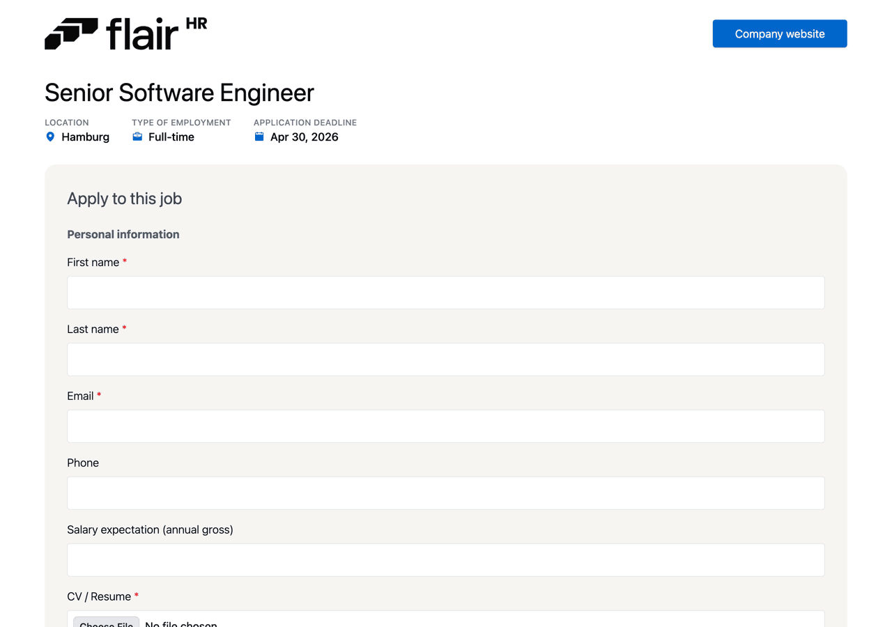
Copy a sample into Custom CSS, then adjust the values to your brand. This is the application form with the default look:
Match your brand fonts and colors
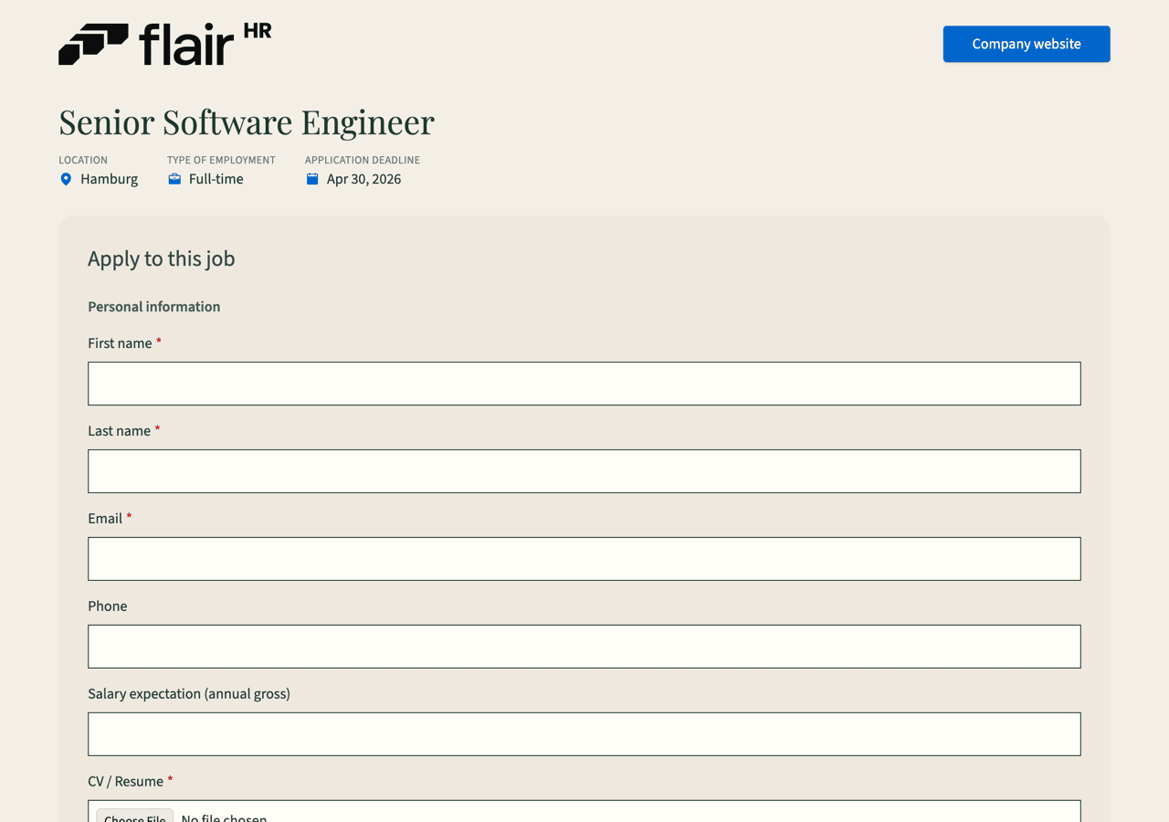
Use this when you only need your brand's fonts and colors. It uses variables only.
@import url('https://fonts.googleapis.com/css2?family=Playfair+Display:wght@400;700&family=Source+Sans+3:wght@400;600&display=swap');

:root {
  --cp-font-family: 'Source Sans 3', Arial, sans-serif;
  --cp-heading-font-family: 'Playfair Display', Georgia, serif;
  --cp-color-text: #1f3a2e;
  --cp-color-background: #f4efe6;
  --cp-input-background: #fffdf8;
  --cp-input-border-color: #1f3a2e;
  --cp-input-radius: 0;
}
What each part does:
@importloads the Playfair Display and Source Sans 3 fonts from Google Fonts. It's the first line.--cp-font-familysets Source Sans 3 for body text, inputs, and buttons, with Arial as a fallback.--cp-heading-font-familysets Playfair Display for headings such as the job title.--cp-color-textsets a dark green for the main text.--cp-color-backgroundsets a warm beige page background.--cp-input-backgroundand--cp-input-border-colorgive inputs an off-white fill and a dark green border.--cp-input-radius: 0gives inputs square corners.
Make the form soft and rounded
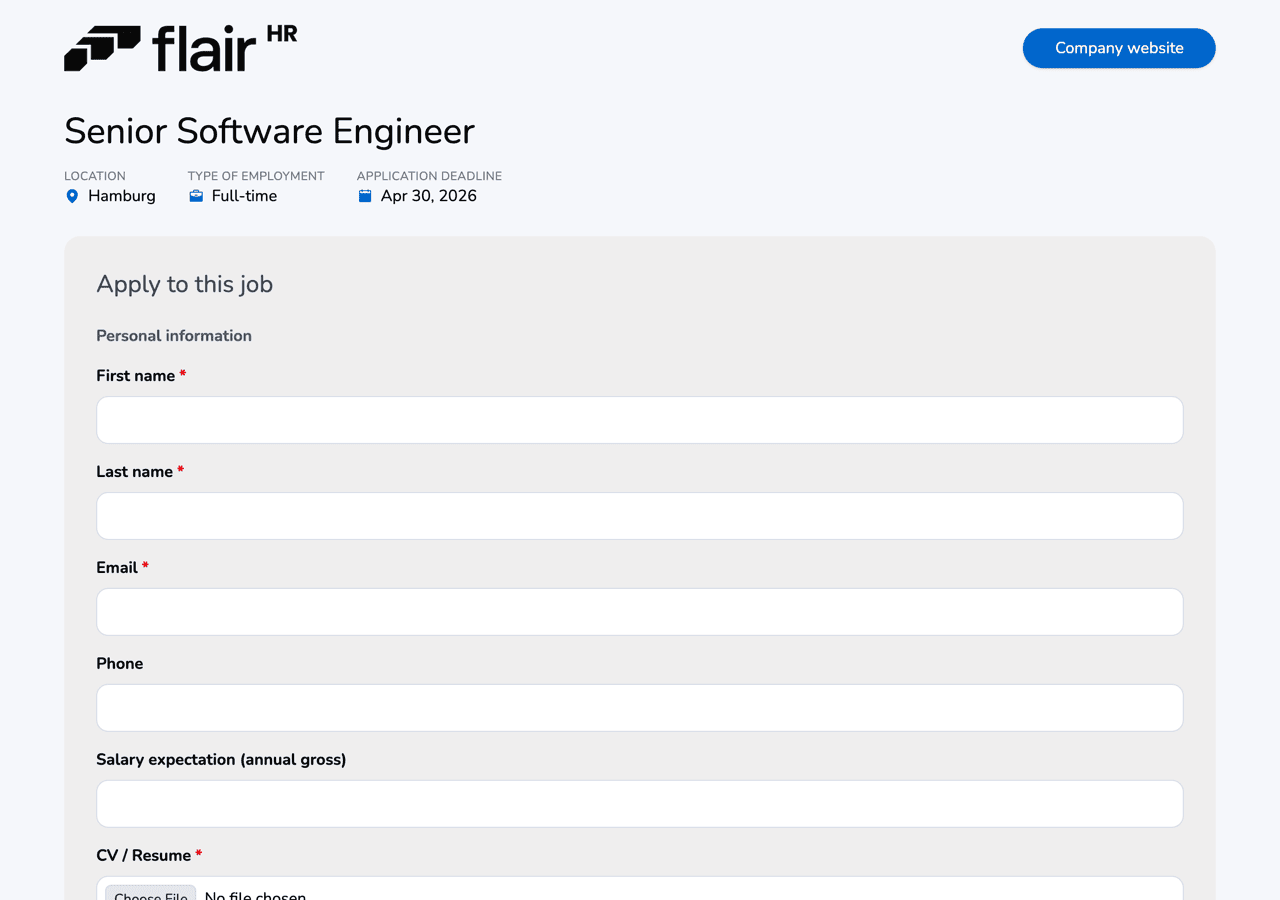
Use this for a friendlier look with rounded inputs and buttons. It combines variables and hooks.
@import url('https://fonts.googleapis.com/css2?family=Nunito:wght@400;700&display=swap');

:root {
  --cp-font-family: 'Nunito', Arial, sans-serif;
  --cp-color-background: #f5f7fb;
  --cp-input-border-color: #d5dbe7;
  --cp-input-radius: 12px;
}

[data-cp="form-label"] {
  font-weight: 700;
}

[data-cp="button"] {
  border-radius: 999px;
}
What each part does:
@importloads the Nunito font from Google Fonts.--cp-font-familysets Nunito for body text, inputs, and buttons.--cp-color-backgroundsets a light blue-gray page background.--cp-input-border-colorsets a soft gray-blue input border.--cp-input-radius: 12pxrounds the corners of inputs, dropdowns, and file pickers.- The
form-labelrule makes field labels bold. - The
buttonrule makes buttons pill-shaped.
Add accents in your primary color
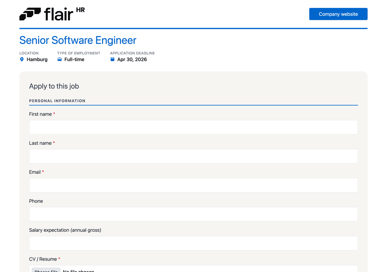
Use this to repeat your brand color across the page without changing fonts. It combines hooks with the read-only --cp-color-primary variable.
[data-cp="header"] {
  border-bottom: 4px solid var(--cp-color-primary);
}

[data-cp="job-title"] {
  color: var(--cp-color-primary);
}

[data-cp="form-section-title"] {
  text-transform: uppercase;
  letter-spacing: 0.08em;
  font-size: 0.8rem;
  border-bottom: 2px solid var(--cp-color-primary);
  padding-bottom: 4px;
}
What each part does:
- The
headerrule adds a line in your primary color under the top bar. - The
job-titlerule colors the job title in your primary color. - The
form-section-titlerule turns group headings, such as Personal information, into small uppercase labels with wider letter spacing and an underline in your primary color.
Because every color comes from var(--cp-color-primary), the accents follow Primary Color when you change it.
Keep your CSS working after updates
Only the variables and hooks in this guide are supported. We keep them stable and announce any changes. Keep these limits in mind:
- Other selectors, such as flair's class names or the element structure, are internal and can change without notice. CSS that relies on them can break after an update.
- CSS changes styling only. It can't change texts or the layout structure of the portal.
- Each career portal has one Custom CSS field. To style several portals, add the CSS to each one.